Showing posts with label seagulls. Show all posts

Aug 15, 2019

Have you De-cluttered your Paintings? Painting & Drawing Tips

Have you tried to sell a house recently? 
Do you watch the House Selling Reality shows?
 If you have you know all about ‘staging your house’ for selling.
BIG BLUE -  Graphite, 8 x 16 inches   $450 Matted, Unframed
This really came home to me this summer as my sister was selling her house. She sent a link to her MLA Listing. OMG! Her house looked lovely but  .  . . 

It looked like nobody lived in it!
Great for selling but not so great to live in.


Ok, I know this is a lot about personal preference.  I am not for full clutter either. I would say on a scale of 1-10, 10 being Hoarder and 1 being Sterile, I am a 4 or 5. I like a few knick-knacks and colour around but I do like to see the counters. 

Where do you fit in?

TREES AND MOSS - I like the white spaces and the combination of finished watercolour with the stand alone ink work

This summer I spent a lot of time Outdoor Painting and Sketching.   My Outdoor Paintings were finished pieces but my Sketches were often left unfinished. As such, those unfinished pieces had wide open spaces.  They were definitely 'Un-Cluttered'.   I found myself visiting this idea of clutter in a painting.

TREE ON THE ROCK -  Shingle Beach - Full of that Big White Space


BIG BLUE was the result of my thoughts.  I know, you might place him close to 1 in my Clutter Scale from above but I think of him more as a 2.  I do like the clean white area surrounding him but I feel the rocks/wood at his feet give a sense of foreground and background to the piece.  At the same time as giving him a base.  

Thoughts coming out of trying the 'Great White Space'

1.  Composition: reducing the background makes me much more aware of how my subject must interact with the picture space.  Where it is best to place him;  What creates the mood I want to convey.  

A Very HEAVILY CROPPED BIG BLUE - Certainly doesn't convey his strength and yet fragile place in the world.  This Cropped Piece seems to minimize him. I feel he is cramped by the picture frame.  

2.  Simplification of Information:  When you plan your picture, there is always a need to simplify the information.  You can not paint every leaf, car, building . . . .  You Simplify.  But what is important and what isn't.  Working with a bare background makes you more aware of what is important and certainly changes the conversation as you design you next picture. 

3. Contrast: The Great Empty White Space contrasts with the complex body of my heron. This makes for great Eye Candy.  Do you feel your eyes want to wonder around his body and examine his feathers, legs, feet, eyes , , ,  This idea of Contrast is in many parts: white/dark; bare/complex; soft/rough; sharp/dull; curvy/straight; and more.  Seeing this in action with minimal background makes you more aware of how this can work in other settings.  

4.  Mood: The importance of Mood and Message also become more apparent. I enjoy the Drama of the Black on the White.  It makes for a strong image.  My Message is strong as well: respect, reverence, relevant and yet fragile.  Worth protecting.  Important to the Universe.  

I found these thoughts really carried over to the Finished Pieces I completed.  See August's post:

a.  What Colour is Water?  - rather than finishing the water I kept it loose, added bits of colour and in the case of Heron didn't even define the horizon line.  Do you think it was needed?
b.  Painting and Drawing on the Beach - rather than a complex sky with lots of detail, I have simplified it but still 'suggested' lots.  Enough or do you think it needs more or less?

SEAGULL ON THE ROCKS - Graphite 5 x 7  $130 Matted Unframed
Here again, I like this picture.  I really enjoy that simple/complex contrast and the Drama of the Dark on White.  Makes for an interesting Seagull, eh?! 

Seeing your Subjects in that Great White Space really makes you stop and think, eh?! You can understand some of my thoughts, it did make me take a fresh look at all these issues.  Hope you are inspired by the results. 
Looking to move your Drawing Skills to the Next Level?
September 19-30, I will be at Beecher Place with Art Theo featuring Art by myself, Doris Biddle and Donna Schipfel.  During our stay there we will be offering lessons as well as showing and selling our work. I plan on offering Drawing Classes on the Sunday,
 as well as a Drop-In Session at the end for those that want to practice more from the classes or would like help in their own projects or starting new ones.  see info below ↓  ↓  ↓  ↓

Doris will be offering a 2 Day class working with Acrylics $80 and a Ceramic Painting class $45.  Donna will be offering 2 classes on Watercolour on Rice paper $40 ea. 

My Drawing Classes: 
Sunday, September 22 & 29, Beecher Place, Crescent Beach, S Surrey. 1-3pm. $40 ea. 
Part 1: Get that Line Drawing Right - Sept 22
Part 2: Values, Light & Shadows - Sept 29
Beginners to Advanced Welcome.  Come to one or both.      
Drop-In and Draw
Monday, September 30, 1-4pm Beecher Place, Cres. Beach $20.  Get tips on old projects or new.
Contact Wendy to Register and for more information.  


OR Book a 3 Pack of Private Lessons with Me - 3 Lessons 2.5 hr each $225


FYI
I am scheduled for a Demo at Opus this fall: 

 Drawing: Values, Light & Shadows - Saturday, Oct 19, 11-12:30 or 2-3:30 Free 
Contact Langley Opus to Register  604.533.0601


My Etsy Store is always OPEN: Etsy - WendyMouldsArt

Originals, Prints, Commission Work and Instant Printable Cards for all Seasons available.

Be sure to like and share my posts to keep me coming into your box, 
You won't miss a single post if you Follow by Email or Like my Facebook Page.
Have a great Artful Day,

Wendy

Jul 25, 2019

Painting & Drawing on the BEACH - Painting and Drawing Tips


THE STRUGGLE IS REAL!!!

The weather was awesome as I headed out each day to paint on the beach.  Sky - fabulous blue with puffs of white clouds, giving everything that ‘feel good’ feeling.  Sun - shining bright, warm but not not smoking hot.  Tide Out - leaving lots of interesting rocks, shells  and treasures in its place.  Wildlife - seagulls, oyster catchers, heron, crow and even an bald eagle joining me.  


DEER ON THE BEACH - Matted 11 x 14, watercolour & Ink. $225 

So what’s the problem?

Grey . . . .    Washed out Grey.

I love to paint and draw in the forest but there is always a problem - Green.  Here on the beach, the problem is GRAY. 

Grey logs

EVERYTHING IS BLEACHED GREY!

See what I mean - GREY

Those wonderful knurly logs glistening in the sun.  The rocks peaking out of the water as the tide slowly moves out.  The old piles still standing in the water, from days gone by.  And of course, don’t forget the sand.  Grey, Grey Grey.  Not even a dark or light grey, a washed out grey.  Bleached by that very sun that is making it such a wonderful day. 

The Struggle is Real. . .

Working on the Beach

You know what it is like. You have been there too, I’m sure. 

This summer I decided to face the challenge head on. 

SEAGULL: CATCHING SOME SUN - Matted 11 x 14, watercolour & Ink $225 

Seagull: Catching some Sun was my first challenge.  I laid out my logs in ink first.  That felt extremely good.  I decided I wanted a seagull on the log and drew that in.  
Layout for Seagull: Catching some Sun - Logs are ready for my seagull


I painted the log with the seagull. 

Ooooh, so easy.  It was backlit and fairly new so it had colour.  But the other logs were all in the sun and all grey. 

Things I noted:

1.     They had different values.  Subtle but different

2.    The angle of light that hit them caused slight differences in colours

3.    I felt the pull of warm and cold colours- I know they were all in the sun, but I did feel it.

The backlit log is ready now it is time to paint the 'grey' logs


4.    I began to look for things that would give reflected light/colour.  The ‘easy log’ I decided would give a warm glow to the log below.  With the grasses there, there had to be some greens in the logs as well.  Blues from the sky and yellow/oranges from the log. 

5.    Once I started, I realized a hard, cold black would not work for all my darks.  Purples and mauves seemed to work much better. 

Suddenly I had lots of things to put in my logs.  I kept the colours thin and muted, but still very much there.  Wet into wet, thin glazes over top, and even a bit of dry brushing in the end.  The process wasn’t quick.  I kept checking that I had the right warm/cold feel to the colour.  I blotted lots to remove something I didn’t like.  I studied the logs some more.  I waited for paint to dry.  

"Hey, time for a walk"

Suddenly Max nudged me.  Time to go, we had sat there long enough.  He was right. 

Leave it.
Study it.
Come back tomorrow. 

Things will be different. 

ROCKS ON ERICKSON'S BEACH - Matted 8 x 10, watercolour& Ink $130

Do you fight with greyness of the world when you paint?  What moves you forward?  

I felt I had made a real breakthrough into the world of grey this summer.  

Special Note:
Want info on my pallet?  I used my little travel kit for all the paintings More info on it HERE.  


Are your sketchbooks calling you?  Looking for more practice.

If you live in the Fraser Valley, think about joining me this summer for a Morning of Outdoor Sketching.  An easy way to immerse yourself into sketching with ink and watercolour.  See the info below ↓  ↓  ↓  ↓

OR Book a 3 Pack of Private Lessons with Me.

Join me for a morning of  Outdoor Sketching: 

Small group Outdoor Sketching Classes on Tuesday morning, July 30, August 6, 13, and 20.

The classes will be small, max  5.  We will meet at 10-12:30 in a few of the local parks in North Surrey.  ie. Bear Creek Park, Tynehead Park.  The cost is: $45 tx incld. per session  Book all 4 sessions for $150. Bring your own supplies
Contact Me to register.   and for more information. 


My Etsy Store is always OPEN: Etsy - WendyMouldsArt

Originals, Prints, Commission Work and Instant Printable Cards for all Seasons available.


FYI
Plein Air Event at Kilby Historical Site - August 16 -18, 2019


215 Kilby Rd, Harrison Mills, BC – approx. 1.5 hr drive from Vancouver
(or stay our there. I like to camp at Kilby Campsite but there are lots of  places to stay close by.  Makes for a great little adventure.)

 On Friday, Saturday and Sunday morning, painters will be capturing  breathtaking historic vistas, 1920s farm equipment, historic buildings, lush gardens & orchards, delightful farm animals and surrounding mountains.  Not hard to find something to catch your eye.

This is a fun, outdoor adventure for everyone.  Sunday afternoon, brings live entertainment and awards ceremony.  There is a competitive and non-competitive part to the event, so great prizes for everyone.  Cost $15 Registration: events@kilby.ca  more info: kilby.ca

I have been part of this event since it started 5 years ago and I never get tired of wondering the grounds and finding little vignettes to paint.  I know you will enjoy yourself.

If you decide not to join us to paint, come out and see the fun.  On Friday and Saturday,  Artists are set up all over the grounds working away or come see the 'Showing and Sale' on Sunday.

Be sure to like and share my posts.
You won't miss a single post if you Follow by Email or Like my Facebook Page.
Have a great Artful Day,

Wendy


Nov 2, 2017

Get those Values Working for You -Painting & Drawing Tips

Have you ever finished a painting and felt it just looked flat?
There is no life to it.  Yet, you planned, worked hard and tried everything.  
Where did you go wrong?

Bright Bold Poppies - One of my favourite things to draw.  Especially in Ink.

Take your painting, photograph it and then turn it into a gray scale picture.  (You can do this easily with the Edit feature in Photos on your phone or Ipad.  It's a great little feature.)  When you see the picture in gray scales, without the distraction of colour you have a much better feel for the values that are in your work.  This is where the Magic happens.  It is the strength of the values that can turn that flat shape into a Dense, 3 Dimensional Mass that really seems to come to life. 

Seeing Values in Action - The MAGIC Element of Art

Here is a drawing of the poppies from the last post (see here)


Take a look at the poppies you worked with in my last drawing post.  In that post you completed the line drawing.  The drawing gives a sense of Depth and Mass because of the layering; petals in the back, the center, petals in the front, stems and little leaves and flowers layered on the page. I love the look of ink but adding graphite (values) can make it even more interesting.

Add some values - I used a pencil but you painters can use paint.

Here is one of the poppy with one value on it.

Yes, this poppy looks pretty 3 Dimensional, but not because of the shading.  It is more the work of the stem and the little leaves that gives it Volume.  The graphite almost flattens it. It is all one value.   Cover up the stem area as you look at it and you will see what I mean.

Here is my Poppy Reference. If you want to try the drawing, Contact me if you would like a better reference file to work with.  I would be happy to send it to you.

Now study the picture reference and add the values.  (I used a 6B pencil for the darker areas and 2B for the lighter areas.) Work by layering your graphite.  Using circular strokes build up your darker areas, always blending them into the lighter areas.  Yes, you can use just a 2B pencil to put in your values and use lots of pressure to get the darks.  I prefer to use a variety of pencils to get my darks as it requires less pressure and I get more texture on my paper.  I am not flattening the tooth of my paper with lots of pressure.

Some things to note: 

You have a value scale of 1 to 10.  1 is white and 10 is your darkest dark.  There are no 1's or  10's on the petals.  You need to keep your values inside of that range.  The white (no. 1) needs to be saved for the main poppy on the right.

When shading the light petals: the petal on the far left is the lightest, the one on the far right is next and the light petal off the center at the back is next. 

When shading the dark petals: the front petal has the darkest areas and the back petal is not as dark. None of the petals has a full Value of 10. 

The only 10 is just where the flower, leaves and stem meet.  Notice how that really grounds the flower and gives it that sense of life you are looking for.  You can see the same affect on the lower poppy where the darks have been done in ink.


Poppy with full Values
Now this is a POPPY.  The darks and lights of the graphite really give that Poppy mass.  It definietly looks alive, open to the sunlight. 

As you work with your drawings and paintings you need to always be comparing the values; who is lighter, who is darker and who is the same.  Go back to that gray scale picture of your painting/drawing.  How do those values compare? Punch some of them up and drop some of them back.  You have a scale of 1-10, make sure you use all of it.  Working on pencil drawings really helps to sharpen your sense of values. 

 Working in colour really doesn't change anything.  There is still values to be modulated only now it is done with your colour choices rather than graphite.  Often artists comment that it is really not the colour that is important it is the value.  As you can see from the two painted pictures I have included their volume is developed with the values of the colour.  I even played around with colours with my gull to emphasis that.

READY FOR MISCHIEF - 5 x 7 - $135 (Matted, unframed)
Note how the dark values create his Mass, your eye totally accepts the strange colours (green, orange, purple) When the value is right the colour is not important

Looking for other drawing information, See the previous drawing posts:

How to Find Your Starting Point in a Drawing
  4 Ways to Grow the Sketchbook Habit
Time to Meet Your Drawing Friends
Ready to Start Drawing - Get Your Materials Together

Next up: Working with Blenders - the secret to the soft touch of Graphite.   See you next week.


 Etsy Shop now Open: WendyMouldsArt  Come on In!! 

Special Offer: Free Shipping with your order of 5 or more  Christmas Doodle Cards or buy the Digital Down Load Cards and print as many as you wish.

Great DIY Christmas Project:  Make Your Own Christmas Cards 
Christmas Card Doodle Classes Happening in November

Kitten and Puppy are happy to be featured on Your Special Cards
You will make some Great Christmas Cards for those Special People using my friendly little kitten and pup.  We should make a least 2 cards and you will feel confident to make more.  $35 all supplies included.
Classes: 
Sat Nov 18, 10:30-12:30 or 2:00-4:00  Art by Wendy Studio, North SurreyThurs Nov 16, 2:00-4:00 or 6:00-8:00   Art Expression Gallery, Maple Ridge.Wed, Nov. 22, 3:30-5:30 Gardenworks at  Mandeville,  South Burnaby 
 Contact Wendy Here to register. 

Time to Move Inside and Draw
Drop-In & Draw: Tues, Nov. 7 10-12pm & 1-3pm
January Dates: Tues, January 9 & January 23, 2018
Expressions Art Gallery, 227 & Lougheed Hwy, Maple Ridge.  
Choose a morning or afternoon session. Bring your sketchbook or your project and come draw.  I will be happy to give you a few pointers as you work on your drawing.  $15 Pre-Register Required. Contact Wendy Here

Be sure to like and share my posts.
 You won't miss a single one if you Follow by Email or Like my Facebook Page. Keep up with all the art events by joining my email list (see sidebar on my blog)

 Have a great artful day,
Wendy

Feb 9, 2017

Drawing A Seagull - Part 2 - Painting and Drawing Tips

NEW WORKS FROM THE STUDIO OF ART BY WENDY
Welcome back
Today is the exciting part of drawing: Bringing that seagull to life by shading him in.  If you haven't drawn your seagull yet, follow along step by step in my last post here.
My Seagull - note my materials and the ipad screen for reference
To start, organize your materials:

(moving left to right) I have kneaded eraser, 5/8 inch blender, 1/4 inch blender, 3B pencil, soft watercolour round brush size 4 (dedicated to drawing), F pencil & 2B pencil, a paper to rest my hand on, a drawing chamois and my 1 inch brush to clean my work. And of course a value scale.  I keep my little 10 point scale in front of me. #10 the darkest and #1 the white of the paper.   (If you are making one, be sure and use the kind of paper you are drawing on as it will give you the right information for your paper)

When I return to a drawing I like to warm up a bit before heading to critical spots.
I like to lay in the darks first 
So I am going to start with my wing area. Every artist has their own method to start, I like to lay out my dark areas first and then fill in with my lights.  I am using my 2B and putting down a 5 Value for the darker areas on the wing.  Then very lightly, about a 3, I shaded in the whole area.  By doing the darks first you can just shade lightly over everything without worrying about stopping at edges.

Next take your blender and gently shade over everything.
Blend from dark to light to soften all the edges
 I use a circular motion so I don't end up with unwanted lines. Note the smooth texture as you flatten the tooth of the paper.  Also note how you drag the dark areas to the lighter areas as you go.  Now taking my kneaded eraser I lighten up the areas that are too dark. With my 3B I go in and touch up any of my darks bring some up to an 8 or 9.
Lighten and touch up time.  Keep that shoulder area soft and light


Now I head for the legs and feet.
The legs can be left unblended as their texture will contrast with the soft the feather area


You know how I love those knobbly little legs.  Using a 3B I pick out the darks. Then using my F pencil I lightly fill in the legs and feet.  Again picking out the lights with my kneaded eraser.

Finish up the tops of the legs and the underpart of the wing.

Take your smaller blender and load up with graphite.  See my scribble on my paper under my hand.  That is where I load my blender and then shade in the tops of the legs and under the wing.  Again, using small circular motions.

Now the head.

Go slow here, work in layers rather than hit the darkest dark right away
I feel warmed up and ready for precise work so I head for the face. Again first working on the darks of the eyes and the beak.  Note the beak is really only a 7 in the shadow area and the top part is about a 2.  I save that for my blender.  Once the eye and beak are done I take my blender and draw in the darker shadows. I follow that up with a soft brushing to blend the edges of my shadows.  At the lightest part of his head, really soften your line so the light can come into his head.  It really intensives the idea of the white.

Just the belly to go now. 
The light pencil area is only in the darkest part of  the belly.

The belly has some real darks in the shadow area.  I know, hard to believe when you are talking about white. But it will probably be an 8 or 9 in the darkest part by the time I am done.  It is important to think in layers and not rush to your darks.  I first laid a light pencil shading to the darkest area.

Sometimes it seems like nothing is happening but be patient and build up the layers

Then using my chamois I rubbed the graphite in.  It is important to get rid of all the pencil lines.  Now loading my chamois, just as I did the blender I build up layers on the belly.  You can add some more layers with your pencil but lightly as you do not want to leave any lines.

Final touches

Once I have the main belly area done, I take my blender to tidy up the edges.  With your finger in the chamois it is hard to do the small detailed areas and to finish up the edges.  Note that light shadow under his beak as it helps to convey the roundness of the belly.

The logs
Tidy up the belly and move on to the logs, the end is in sight!
As you probably guessed, I first drew in my dark areas with my 3B.  Then followed up with my 2B lightly shading over the logs, individually. Now I am using long strokes to shade as I want to simulate the grain on the logs.  Areas that I wanted to 'bump up' a little darker I glazed over with my F pencil.  Note: To really make your seagull 'stand' on the log, pay close attention to where the feet and log meet.

Your done!! 

 Looks good.  What is your favourite part of the drawing?  I love my little knees but I am particularly happy with how his face turned out and I love my logs.  I can really feel the smooth texture of those weathered logs.  (Remember, positive thoughts before that mean old critic gets in there.  See my post on 3 Ways to Turn Drawing Despair into Action here. )

 Take the Plunge and start drawing!  If you want some help I have several ways to help:

1. Zentangle Doodle Card Classes:
Thursday, Feb 16, 1:30 - 3:30pm & 6-8pm Expressions Art Gallery, Maple Ridge.
Saturday, Feb. 18, 10:30-12:30 (FULL) & 2-4pm. (1 Spot Left) Art by Wendy Studio, N. Surrey   $30 Supplies Included. We will be working with mice and owls on our Zentangle Doodle Cards  (you knew I would have animals somewhere) Contact Wendy to REGISTER

2. Buy a few of my Zentangle Doodle Cards and start  Colouring. See my collection here.   They are fabulous fun, just imagine how special your cards will be when you personalize them like that.  Those special people in your life will cherish your cards.

3. Private Drawing Lessons -  2.5 hr sessions in my studio, flexible scheduling to fit your schedule. 3 lesson package $225. Beginners to Adanced are welcome.  Adults, Teens and Younger Students. ( $35 for 1 hour sessions for younger students.) more info here

Special Note to Artists: 
February is Marketing Month for Artists, time to really work on your Business Plan. Join me for a full day of getting ready to make 2017 your Best Sales Year ever.  

All day Marketing Workshop - Let's Get Your Art Out There - Sunday, Feb 26 or March 5, 10-3pm.  This is an opportunity to work with a small group focusing on ways that work for you, to market your art.  Whether you are looking at full time or part Art Sales, there are effective, proven strategies that will get your work out the door. $70 Limited to 8 per session.  Art by Wendy Studio/Gallery, N. Surrey, BC.  REGISTER NOW  with Wendy.   Out of Towners  & Skytrainers give me a call and we can set something up.

Etsy Shop now Open: WendyMouldsArt  Come on In!!

 Be sure to like and share my posts.
 You won't miss a single one if you Follow by Email or Like my Facebook Page. Keep up with all the art events by joining my email list (see sidebar on my blog)
 Have a great artful day,
Wendy

Feb 2, 2017

Drawing A Seagull - Painting & Drawing Tips

NEW WORKS FROM THE STUDIO OF ART BY WENDY

Actually this really should be called "Pencil and Eraser Becoming Friends" .

Learning to draw is a daunting task but when I talk with my friends I realize it is something many want to learn.  They don't aspire to be another Leonardo de Vinci but they do want to draw and have enjoyment in what they do. That is something I can totally relate to.  That was my goal when I started.

Their comments and concerns have lead me to this lastest series of posts on drawing.  Last post, Erasers: Your Friend or Enemy? was a start in getting your materials in order and ready to draw.

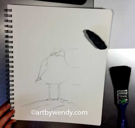
 Today, let's jump in and draw this seagull
Look for a basic shape or line to start with: two circles works well here
 I will be using my Derwent 2B pencil.  It gives a nice soft line without scoring the paper.  Remember to keep your layout lines soft, they are gestures that you will refine as you go along.

To start, study the subject a bit. 

Look for shapes or lines to get started.  In this case a circle with a flat top and bottom is a good starting point.  I placed a smaller flat circle on top for the head.  The legs are started with a line.  (note the legs are not perfectly straight. Try and include those little bends in your gesture).

Big Circle and small circle, gestures to start
As you are drawing your circle study our little guy. Is the head in the middle or to the left.  Is it half the width or less of the seagull's shoulders.  Look for these kinds of relationships as you draw each shape.  

Time to Measure and Refine

When looking at your subject use your pencil to measure a small section that can be then used as a unit of measurement.  For the figure, the unit is often the size of the head.  In this case I have used the distance between the bottom of the foot to the belly.  I can see that the seagull is 3 times this distance.  I can now refine my shapes, add a bit to the belly on the right and to his back on the left.  Notice, I haven't done any erasing yet.  Leaving my old lines there gives me a frame of reference as to how much to add.  
My pencil can also be used to check the angles of things, which I did to draw the lower part of the wing. 

 
Using you pencil, measure the seagull.  In this case I used the distance from his foot to his belly as a unit of measure.  I found that he was 3 units high.  As I refined my shapes I kept this relationship in mind. 


My pencil can also be used to check the angles of things, which I did to draw the lower part of the wing. 

Drawing the legs.

No, you don't have to draw them in first but I love those knobbly knees. They looked fun to draw so I did. (This is one of those little encouragers I talked about in dealing with Drawing Despair, see more here.)  There is no rule as to where to start in refining your drawing just make sure you are happy with the over all shape before go into the detail. (Note my line gestures for my legs became the middle of the left leg and the side of the right.)

Move around the drawing refining each part.


Checking reference Lines as you go

As you move around the drawing use your pencil to check your reference points.  The right leg to the shoulder and head and the left leg.  How does the negative space beside the the pencil compare with the seagull?

The beak

Beaks on birds are always a problem.  Use gesture lines to get the shape and carefully refine them.  I have left my gestures around the beak so you can see what I did.  When I was happy I erased all the ones I didn't want.
Soften lines and clean up unwanted ones.

Clean up time

Once I have settled on my layout, I clean up the unwanted lines with my kneaded eraser.  At this time I also go around and lighten lines that are going to be white: top of his head and his shoulder and the top of the beak.
My little seagull is ready to be shaded in.  Get your drawing up to speed and we will shade him in next week.

Take the Plunge and start drawing!  If you want some help I have several ways to help:

1. Zentangle Doodle Card Classes: Thursday, Feb 16, 1:30 - 3:30pm & 6-8pm Expressions Art Gallery, Maple Ridge.  Saturday, Feb. 18, 10:30-12:30 (FULL) & 2-4pm. (1 Spot Left) Art by Wendy Studio, N. Surrey   $30 Supplies Included. We will be working with mice and owls on our Zentangle Doodle Cards  (you knew I would have animals somewhere) Contact Wendy to REGISTER

2. Buy a few of my Zentangle Doodle Cards and start  Colouring. See my collection here.   They are fabulous fun, just imagine how special your cards will be when you personalize them like that.  Those special people in your life will cherish your cards.

3. Private Drawing Lessons -  2.5 hr sessions in my studio, flexible scheduling to fit your schedule. 3 lesson package $225. Beginners to Adanced are welcome.  Adults, Teens and Younger Students. ( $35 for 1 hour sessions for younger students.) more info here

Special Note to Artists: 
February is Marketing Month for Artists, time to really work on your Business Plan. Join me for a full day of getting ready to make 2017 your Best Sales Year ever.  

All day Marketing Workshop - Let's Get Your Art Out There - Sunday, Feb 26 or March 5, 10-3pm.  This is an opportunity to work with a small group focusing on ways that work for you, to market your art.  Whether you are looking at full time or part Art Sales, there are effective, proven strategies that will get your work out the door. $70 Limited to 8 per session.  Art by Wendy Studio/Gallery, N. Surrey, BC.  REGISTER NOW  with Wendy.   Out of Towners  & Skytrainers give me a call and we can set something up.

 Be sure to like and share my posts.
 You won't miss a single one if you Follow by Email or Like my Facebook Page. Keep up with all the art events by joining my email list (see sidebar on my blog)
 Have a great artful day, Wendy
Sep 1, 2016

What the heck is Underpainting in Watercolour all About? - Painting & Drawing Tips

NEW WORKS FROM THE STUDIO OF ART BY WENDY

 Okay, so what is the big news.  You know under painting is the first layer of paint that is put on your ground.  It is just the base for the layers that come after.  It is very common practice in working with oils and acrylics. 

However, Watercolorists like to use it too.

But as in all things, watercolour  artists are different. 
READY FOR MISCHIEF - 5 x 7, Watercolour
Note how the background colours run right  into and out of my gull. 
Some artists do very detailed under paintings to define the values while others are fast and loose putting colour everywhere.  I just finished looking at Tim Saternow's work.   He uses Payne's Gray to do a detailed value painting of his street scenes before he adds his colour.  (There is an excellent demo of this in the 19 Issue June/Sept. 2015 of The Art of Watercolour.)  But it is the fast and loose underpainting that catches my eye.  Kim Johnson, who I mentioned in my last post,  does animal portraits with this method, I wanted to give it a go.

My first attempts were with my crow, Busybody, see here and Ready for Mischief, my seagull, above.  You can definitely see I was pretty bold with my underpainting, well bold for me.  I was swirling colours and just having fun.  I did have my drawing down first and I was careful to preserve my white areas but other then that I just dropped colour, wet into wet. 
Once my little experiments were finished I went for the big stuff.

Here are a few ‘work in progress’ pictures for my picture, The Hunter Waits.  
First a pencil drawing of the main shapes. 
My underpainting was lots of splashes of colour on wet paper.  My main goal was to:  preserve the white of my eagle’s head and tail; use all the colours that would be in later layers but in a purer form; use colour in the low to mid value range.  Once the underpainting was finished I let it dry completely.
WIP  #1:  Here the under painting is dry and I have started to layout the rocks.  You can see how the colours blend with the rocks in different ways.  Note the back wash marks along the bottom. 


WIP #2:  More layers  of paint on the rocks, finished the ones in the top right corner.
 Note the detail of the rocks below, you can see how the red under painting is showing through.  It adds interest to the rocks and connects the small rocks to the larger ones. 

WIP #3:  the body of the eagle is now being filled in. Again some of the under painting helps to add interest and connects him to his surroundings.
WIP #3: I love how the the rock in the foreground has those interesting blues and purples from the under painting. 
The finished painting "The Hunter Waits" is in my last post here.  

Things I noticed as I painted:
- lovely little spots of colour showing through in my rocks and sand that made each rock a little different
- great under tones in my sand, in some places I glazed over the sand but others I left alone. 
-it was nice not to have the stark white paper glaring at me as I painted.  It somehow seemed easier to blend my colours and judge my values.
-I wished I had let a bit of my under painting flow into the eagle’s tail as it was too white without some of the local colours on it. I ended up having to paint some in.
-the flow of colour in the under painting seemed to tie the picture together in a more cohesive way. Each part felt connected to the whole. 

Is underpainting fast and loose for every picture? Probably not.  Should you give it a try? Definitely.

Pull out the paper, pour and play, and then paint away.  Be sure and share your results with me. 

Fall is coming fast but there is still time to paint and draw outside.  Check out my series of  Drawing Tips for Summer Fun.  It is a four part series starting here.  Great ideas for quick sketches in your journal or plein air pieces.  Best of all when the cold wind blows you can take these ideas inside and keep on going.


Looking for a starting point in your drawing?  I will be happy to get you up and running.  Call me now and set up a few lessons to get you on the road to a summer of fun with your art.
For Commission Works see here
For Private Drawing Lessons see here
For Marketing Mentoring see here
For Marketing or Art Presentations Contact Wendy 


 Be sure to like and share my posts. You won't miss a single one if you follow by email or Like my Facebook Page. Keep up with all the art events by joining my email list (see sidebar) Have a great artful day, Wendy