Showing posts with label putting colour into a green landscape. Show all posts

Jul 3, 2025

The Best kept SECRET of Mixing Watercolours - Painting & Drawing Tips

Watercolours have SECRETS.  Lots of Secrets.  
I discovered a Big one while on my painting trip to Ireland.  

An Iconic Painting for my Ireland Sketchbook

Ireland is green. I mean really green. It makes us here on the West Coast pale in comparison. So when it comes to painting in Ireland, you need to deal with 'all the green'. Light green, dark green, mauvy green, blue green, yellow green, golden green. . . Tons of different greens.

Hearing about all the greens of Ireland, I knew I was going to have a challenge for my Sketching on the trip. Before I had left on my trip I did introduce a new yellow (Quinophthalone Yellow - DS) and a new green (Green Apatite Genuine - DS) to my travel pallet. I was planning to make new mixes with them. The Green just didn't work at all. The yellow however opened up a new world for me.

That’s when I discovered the biggest secret of all. ******************** For further discussion and examples see my YouTube Video: 4 Ways to Mix Watercolours **********************

Mixing in the palette just doesn't always cut it. I like to use a premix green (Sap Green) in my outdoor pallet and then I push it towards a warm or cool colour by adding different colours to it. ie. adding Ultra Marine to Sap Green gives a nice blue green. You probably have your own recipes that that, too.

Sap Green and Quinophthalone Yellow with my Yellow underpainting
But here’s the Problem:

I took my cold yellow Quinophthalone Yellow, and mixed it with my soft green to get a nice lime green to put in the sunshine. That’s not good enough here in Ireland you need a variety of lime greens. So I tried something new for me.

I took my cold yellow, and I did lots of under painting with it. Some of it quite heavy and some very lightly. I had started working with this before my trip but only in small sections. On my sample above, I started very dark and then slowly lightened up. Then let it dry.

While it was drying I mixed the green and yellow wet into wet. Letting each colour mingle and move. This is one of the more common ways of changing the colour.

Bottom line - Wet into Wet; Top line right, premixed yellow & green (light and dark) 

Once the underpainting of yellow on my sample was dry, I glazed over it with my green. See Below. (Glazing is painting a thin layer of paint over a dry layer of paint.) Looking closely you can see having different values of yellow in the underpainting creates some very subtle variations in my lime green.

You are not limited to doing this only once. Glazing over the yellow with several layers of green also can vary the intensity of the resulting color. (You can glaze over a colour many times but be sure and make sure all the underlying layers are dry and only do light layers each time.)

Glazing the Green over the Yellow

I decided to take things one step further.  I did an underpainting of the green and then glazed over it.  See Below.  
Glazing Yellow over the Green

For each of the swatches I tried to have the darkest, strongest pigment on the left and get lighter as I moved to the right.  When you study the samples you can see very subtle differences in turns of value and hue.  But when you see the results in a picture it becomes very clear. 
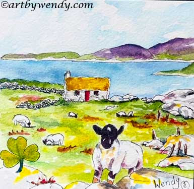
My Iconic Ireland - Note all the different 'greens'

 As you study my little picture you can see how those subtle greens are soft, dark, warm and cold. The center midground and foreground have an underpainting of yellow. I used not only yellow and green glazes but also blue as a glaze over my greens.  

******************** For further discussion and examples see my YouTube Video: 4 Ways to Mix Watercolours **********************

Glazing over a colour can create very subtle colour changes in your painting.  It is certainly something you may want to spend more time on. 


Taking Registrations for my Spring/Summer Events: 

  • Create Your Own Adventure - Let's go Outdoor Sketching  2.5 hr $85 Ind.  Sm Group Rates $65ea  Contact Wendy to set up a date. Location: Lower Mainland

  • Sept 29, 6-8pm - Art Critique - Join me for a gentle critique on one of your paintings,  is the perfect space for discussion, learning, and creative growth. FREE   Registration Required - Langley Arts Council 

  •  October 5, 9:30 -1pm - Make Friends with Your PenThis playful workshop helps you loosen up, build trust in your lines and discover pen work can strengthen your overall drawing skills.  Mission Arts Council: Register 604- 826-0029

  • Save the Date:  next set of 3 Zoom classes Thursdays, October 9, 16 & 23. Study of Shadows & Colour - Enhancing Your Drawing & Painting Skills.  Early Bird: $75 after Oct 7, $90

Original work, Commissions, Private Drawing Lessons, Prints and Cards of her Work, 

Be sure to like and share my posts.  You won't miss a single post if you Follow by Email 
Have a great Artful Day,


Aug 7, 2023

5 Steps to Find Patterns of Colour in an ALL GREEN LANDSCAPE - Painting & Drawing Tips

Adventures are calling you! Time to get OUT THERE and have some fun. Swimming, boating and hiking for sure but at some point you will want to sit down and Paint.

The Beaver Den - Colours in an all GREEN WORLD

The wonderful part of summer is that flowers are bright and beautiful. The mountains are shining in the sun and the trees are no longer bare. Everything is encased in a sea of Green. It’s wonderful!

But that GREEN can be awful!!!

Beaver Den on the Island - Surrounded by GREENS

Everything is green. So how do you find your way. It's all GREEN.

*** Here is a link to my YouTube video that further explores this topic: Finding Patterns of Colour in an ALL GREEN LANDSCAPE.

I just came back from a camping trip and and of course I was encased in the GREEN World. As I painted a little island that held a beaver den, ways to fight the GREEN began to emerge.

Pencil lines to find the main shapes and patterns - changes in values

Here’s how I Attacked THE GREEN’S:

  1. I looked for subtle changes of values. These signal a change in vegetation.

  2. I looked for patterns. Those value changes make shapes. Those are my keys to see patterns that are different colours. As I sketch in the scene with my pen, the shapes created around the value changes are more prominent. Of course you can do this all in pencil. But you know me, I like to get my pen in there too.

    Ink Sketch - Notice the different shapes that match the different values of green 

  3. I pushed the colours. If a value is light green, I add yellow to it to make it even lighter. A glaze of Colbalt Teal Blue cools it but keeps it light and airy. If the value is a mid-value I add hints of reds and blues to it. Red warms it up, blues cool it down. Thus creating more colours in the scene but still keeping with feeling of green.

  4. I thought about colour temperature. Some shapes are warm while others are cold. You can see in my picture the low bushes are facing the sun and have a warm airy feeling. While the taller bushes are effectively shaded by their height. These are cold. I look for those spots throughout the picture.

    Adding the Colour - notice the shapes have different colours of Green

  5. I introduced new colours. I dropped a touch of red into the shadow areas. No, there was no red there. But I always seem to feel that there should be a touch of red when I am painting so much green. (This is a me thing. Do you have a 'me thing'?) I repeated the red as more of a rusty brown in the background foliage and in several spots in the shadow areas. My own rule is it needs to be in 3 spaces minimum so it 'blends in' to the painting. I dropped in some blues - the sky, the water, and that loggy, looking rock in the middle. I used some purples in the shadows mixed with the red and one of the blues I used. Thus keeping the colours cohesive and yet adding a new colour.

    Finished Picture feels green but in fact has blue, red, purple and yellow

Yes, That GREEN WORLD is a challenge to paint but give it a try. You will really be pleased with the results.

*** Here is a link to my YouTube video that further explores this topic: Finding Patterns of Colour in an ALL GREEN LANDSCAPE.

DROP-IN & CREATE!!! - Aug 28 &  Aug 31, Sept 4 - 1-3pm 

Beecher Place, 12160 Beecher St. (Crescent Beach), Surrey 

I am excited to offer this perfect opportunity for you to bring your own projects to life in a supportive and inspiring atmosphere. Max 3 Cost $20. Contact Wendy to Register.  

Upcoming Events: 

Art Treo – Classes/Show/Sale

Aug 26-Sept 13, 11-5pm Daily
Beecher Place, 12160 Beecher St.
(Crescent Beach), Surrey 

Enhance Your Drawing  Skills Class - Sunday, Aug 27 & Sept 3, 10-12pm  $50

Creating Your Own Colourful Silk Scarf - Friday,  Sept 1, 1-3pm  Supplies Incl $50

Working with Acrylic Inks, Sept 6 & Sept 10, 1-3pm $50

Drop-In & Create, Aug 28 &  Aug 31, Sept 4, Sept 5 & Sept 9, 1-3pm Bring your own projects $20

 Register: Doris 604-476-3515, Wendy  604-314-2232


Awesome Opportunity - Artist Retreats in the Shuswap

September 15-18, 2023

Join me for 4 DAYS of Outdoor Sketching, nature walks, deck and beach time, creative conversations, gourmet meals and simply relaxing 

Your Hosts, Joanne Denis and Myself.   Cost: $450 single room or $300 shared room
Art instruction, transportation (from Lower Mainland), meals and lodging included (Bring your own art supplies.  Space is limited to 8-10 attendees, Register Early with Joanne Dennis. 


Original work, Commissions, Private Drawing Lessons, Prints and Cards of her Work, 

Be sure to like and share my posts.  You won't miss a single post if you Follow by Email 
Have a great Artful Day,
Wendy

Feb 9, 2022

Let Ambient Light put a Sparkle into Your Work - Paint & Drawing Tips

Who doesn't love the Soft Glow of a campfire in the Evening Light?
Everything feels warm and cozy.  Everything tinted gold.  

AFTERNOON TEA - watercolour, 16 x 20  - Note the rosy glow on the hummingbird


When we were in Maui, I always found it amazing how many people gravitated to the beaches when the sun was starting to set. But I guess we all felt the same thing.  As the rosy blush of the sunset washed over the world, everything felt just right. 

This is Ambient Light at its best.  . . .

The rosy red colours of sunset are light rays bouncing around.  The colour tinting everything it touches.  It is easy to see.    

However, there are more subtle forms of Ambient Light . . .

Even as the sun gives light,  each object below, does as well.  As artists we are not really concerned with the physics involved with bouncing light rays but rather how it affects everything we paint. 

(NB. There is a video version of this post with more information on YouTube: Let Ambient Light put a Sparkle into Your Work )


The Subtle touches of  Ambient Light  . . . .

 Looking at this green apple note the shadow side of the apple. This is the view we all see and remember. 

Green apple with White Background.

Now watch what happens as I change the background colour to blue.  Can you see the difference in the colour of the apple.  Especially in the shadow area.  

Green Apple with Blue Background

Another colour change.  This time an orange background. 

Apple with an Orange Background

As the colours change beside the apple you can see the colour of the apple changes as well.  It still is green but there is colour reflected by the background.  It is not a direct light nor a bright one.  It is the ambient reflected light from the neighbouring object.  Neat eh?!  

Arbutus Tree on the Bluff - Ignoring Ambient Light when painting

Ambient Light in Action
I have here a little landscape painting, the kind of thing I love to paint when Outdoor Sketching.  An arbutus tree standing proudly on the rock bluff, scraggy shrubs fighting to survive on the rocky cliff all beneath a summer sky.  
I started the painting keeping each subject as separate as possible.  Greens for the shrubs.  Grays for the rocks. Reds and browns for the arbutus tree.  And blues for the sky.  A pretty scene for sure. 

But what happens if . . . ..

I add the reflections of Ambient Light for each of the elements in the scene.  That means the reflective light of the green shrubs onto the rocks, the tree, the sky.  The reflective light of the reds of the tree onto the shrubs, rocks and sky.  The blues of the sky reflected on  . . . .  Letting each element have its own mini reflective light play out in my picture.    
Close Up showing the large rock and ground before and after the colours of the ambient light are added

Above your can see the ground now carries some reds, browns and golds from the tree and the blues of the sky.  I really like how they add a sparkle to the ground cover.  Even the rock takes on a new life with the greens, blues, reds and browns reflected into it.  

Before and After - Arbutus Tree on the Bluff 

Can you see the sparkle in the After Picture.  Even the sky has more life with the bits of red, yellow and green added to it.  Including the Ambient Reflective Light in your work adds that sparkle but also integrates your pieces and makes them come together.  

My Favourite example of Ambient Light in a Portrait . . .

An artist's whose work I really enjoy is Harley Brown.  He is a Canadian Artist that has won many awards and lots of recognition for his pastel portraits of Indigenous People.  I love the way he uses his background colours to bring his portraits to life.  Not only alive but infused with colour.  Sometimes in a subtle way but other times very bold and bright.   

Have fun adding the Ambient Reflective Light to your paintings and see if put a Sparkle into your work.  

NB.  There is a video version of this post with more information on YouTube: Let Ambient Light put a Sparkle into Your Work 

 Move your work to NEW LEVELS?  

Contact Me for:

1. Private Drawing Lesson: (3 Sessions 2.5 hr each $250)  North Langley, BC (Walnut Grove) 
Do you want your animals to breath, your flowers to sparkle or your people to walk?  Whatever subject your like to paint or draw I can build a drawing program for you.  Private Lessons allow you to focus on the skills you wish to develop.  Wendy is a experienced teacher, providing a calm, relaxing experience as you learn how to use the principles of drawing.  Beginner to Advanced are welcome.  Special rates for younger students.  More info here.

2.  Online: Teaching, Mentoring or Critiquing Your Work - Don't live in the Fraser Valley,  I would be happy to tailor a program just for you online.  Drawing and Painting Lessons, Mentoring you on your Art Journey or Critiquing Your Work with an Eye to Move It Forward.  Drawing & Painting Lessons: 1.5 hr sessions $75.  Mentoring or Critiquing 30 minutes sessions $25.  Flexible schedule and sessions can be longer or shorter depending on your goals. 

Be sure to like and share my posts.  You won't miss a single post if you Follow by Email 
Have a great Artful Day,
Wendy

Sep 19, 2019

Are your Landscapes too GREEN? Painting & Drawing Tips

I live in a GREEN, GREEN world, here on the West Coast. 

When you are outdoors painting did you notice how GREEN it was out there?  The trees. The shrubs. The moss.  Everything is GREEN. 

BIRCH TREES BY THE STREAM - sketchbook page


I am not complaining. I like GREEN.  Here on the west coast there is lots of GREEN.  We have a temporal climate,  mild winters and mild summers.  I love it.  (I am a 25 C  person, any hotter is too hot for me) All this means we have lots of rain and very rich, lush GREENS that are often here year round.  

But all GREEN landscapes are boring to paint. . .  They need COLOUR. 

As many of my readers know, I did a lot of outdoor sketching and painting this summer.  When I encountered my lush GREEN landscapes I did the usual.  Blue greens, yellow greens, light greens, dark greens.  But I realized this was not enough. There was no colour. No drama. I decided this summer I was going to do something about it. I devised a challenge for myself.

My Summer Challenge: infuse colour into my green landscapes that was believable and interesting.  With colours that reflected me.


Birch Tree with a little stream - Lots of GREEN
Did you see this scene this summer? 

Pretty little spot in the park.  Birch Trees (my favourite with their white bark) they even have a few sun and shadow spots on them.  A little stream with interesting rocks in and around it.  Ferns and shrubs giving an interesting frame for the trees and stream.  Trees and foliage in the distance.  Pretty, meditative spot.  But so much GREEN.  

How I Infused my GREENS with Colour:

1.  I looked for other colours, no matter how small to include: dead leaves had rust, tans, browns. 

 2.  I pushed into new colours: red (Quinacridone Red) - hidden in the darks of the foilage; and pure blues (Ultramarine and Phalo Blue) -  Patches in the water, the background and darks on the birches.  

3.  I used a deep purple as my darkest dark.  This meant my transition colours were pinks and mauve from the same family.  (I mixed my purple with Ultramarine and Permanent Rose.  This meant I could make a variation of my purple learning to blue, mauve or pink)

Sound logical, right. . . .

Really #1 feels easy to do and a logical extension to what you see.  But #2 and #3, they really require you to step out of your box.  Red.  There is no Red in my reference picture.  But actually it looks kind of nice and adds a sparkle to the picture.  The purples and pinks.  More Sparkle.  I really enjoy looking at this little picture.  

A few Secrets from my Colour infusion . . .

a. This was not my first picture.  I started off slowly.  Added red.  Robert Genn said to add a bit of red to jazz things up. So I started dropping in red.  Reluctantly.  Quietly. Then got louder.  I liked it. 

b.  One drop of a new colour draws too much attention.  Put it in 3 different places, it blends in. Can be all the same tone or variations.  It seems to settle in. 

c.  I got braver.  I started playing with the purples.  Started adding them. Tried different values.  Tried different hues. Moved to a bit of pink. Some mauve.  

d.  I got even braver.  I added more and more colour.  This little picture brought it all together for me.  It sparkles.  It speaks to me.  

e.  Ok.  I know you might feel it does not look EXACTLY like the spot I was painting at.  But it reflects more than that.  It reflects how I felt about that spot in the kind of colour (language) that is unique to me.  When you chose your colours for your painting whether it is a green, blue, red or yellow, your chose is based on your preference.

Try a little colour in your life.  Don't let those GREENS run the whole show.  

Other posts on colour mixing:

Contact Me to Register ↓↓↓↓
Upcoming Drawing Classes: 

Sunday, September 22 & 29, Beecher Place, Crescent Beach, S Surrey. 1-3pm. $40 ea.
Part 1: Get that Line Drawing Right - Sept 22 Full
Part 2: Values, Light & Shadows - Sept 29   Full
Beginners to Advanced Welcome.  Come to one or both.      
Drop-In and Draw
Wednesday, September 25, 1-3pm 
2 Spots Left   or   Monday, September 30, 1-3 pm 2 Spots Left 
Beecher Place, Cres. Beach $20.  Get tips on old projects or new. 

Contact Wendy to Register and for more information.  

OR Book a 3 Pack of Private Lessons with Me - 3 Lessons 2.5 hr each $225
Based on your Schedule at my Studio, N. Surrey. 

September 19-30 I will be at Beecher Place with Art Theo featuring Art by myself, Doris Biddle and Donna Schipfel.  During our stay we will be offering classes and showing/selling our work. I have Drawing Classes on the Sundays (Sept 22 & 29)  and a Drop-In Session (Sept 30)  for those that want to practice more from the classes or would like help in their own projects or starting new ones.

Doris will be offering a 2 Day class working with Acrylics $80 and a Ceramic Painting class $45.  Donna will be offering 2 classes on Watercolour on Rice paper $40 ea.

FYI
I am scheduled for a Demo at Opus this fall: 

 Drawing: Values, Light & Shadows Saturday, Oct 19, 11-12:30 or 2-3:30 Free 
Contact Langley Opus to Register  604.533.0601


My Etsy Store is always OPEN: Etsy - WendyMouldsArt

Originals, Prints, Commission Work and Instant Printable Cards for all Seasons available.

Be sure to like and share my posts to keep me coming into your box, 
You won't miss a single post if you Follow by Email or Like my Facebook Page.
Have a great Artful Day,

Wendy