
Yes, Paint that Picture Again!!
Hey, I get it. You painted the picture, you expressed your idea and now you're ready to move on.
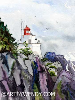
Amphitrite Point Lighthouse, Uclulet, West Coast BC - Plein Air Painting
Try a few small painting/drawings/sketches of one of your latest paintings. See if there are new things your subject wants to tell you.
Looking to move your Drawing Skills to the Next Level?
Hey, I get it. You painted the picture, you expressed your idea and now you're ready to move on.

Amphitrite Point Lighthouse, Uclulet, West Coast BC - Plein Air Painting
I don't mean do this every time. But once and awhile just try the picture again. Use a different pallet, try a different layout, change it up. This isn't meant to be a laborious task but more a learning experience. An opportunity to try something different and see how your original idea might look if expressed in a different way. Or revisit and old idea/subject and try it again. (Read more of the story of painting this original Plein Air painting here)
VanGogh painted over 30 self-portraits between the years of 1886 - 1889. He couldn't afford models and felt portraits would be a could source of income so he used himself to practice. It is interesting to see what he did: different poses, different expressions, different pallets, different styles even different props. You can certainly see growth and changes in his work and understand how his style developed. Read more about his self-portraits here.
I am not suggesting you paint a picture 30 different times but maybe try it 3 or 4 times. I teach drawing and painting skills in private lessons. In the session we do side by side drawing. We each have a sketchbook and we each draw the same thing. I find this way I can discuss the steps in the drawing with my student as we progress. Whenever there is a problem/question we stop and discuss it and look at ways to solve it.
 |
| Sketch #1 of my Lighthouse Practice - The rocks were painted first and set my pallet. I really enjoyed how the colours worked out in my rocks. |
There are several pictures that I use for reference over and over again as they offer special opportunities to focus on specific skills. As a result I often end up painting and drawing the same picture several times.
I can understand why VanGogh painted himself, over and over again.
Some of my thoughts on my repeated Lighthouse Paintings:
1. Each time I painted the lighthouse I noticed more things in the setting. For example the different bushes under the tree. At first I simplified them so much they weren't there. Later I realized there were several different types. It is surprising how you can study a place, paint it and yet never notice little things. The pattern of the colours in the bushes, different types of plants, the relationship between shapes, little things.
2. Change the lighting. In Lighthouse Sketch #1, I accidentally added too much pink when painting the rocks. The sketchbook paper did not allow for me to change things so I decided to go with it. It meant I had to include that colour in other areas. All of a sudden I had a rosy sunset kind of picture. It really intrigue me how that was created. I know that I can take that idea into new work.
2. Change the lighting. In Lighthouse Sketch #1, I accidentally added too much pink when painting the rocks. The sketchbook paper did not allow for me to change things so I decided to go with it. It meant I had to include that colour in other areas. All of a sudden I had a rosy sunset kind of picture. It really intrigue me how that was created. I know that I can take that idea into new work.
 |
| Sketch #2 of my Repeated Lighthouse Practice - Red as a dominate colour is not something I usually do. However, I did like the way it worked into my rocks. |
3. Changing the palette caused big changes in the picture. In my original Plein Air painting the colours are cold. There were really no warm tones and that might have been that it was an overcast day. In my Lighthouse Sketch #2, I repeated the red from the lighthouse in my rocks. To me the rocks hold way more interest than my first one with just the blues and purples. Maybe because I don't often use a lot of red. I quite liked the results.
4. Try different layout/compositions. This I found very interesting. Each layout told a different story. I found the landscape picture (Sketch #1) very pretty and interesting but the portrait pictures seemed more dynamic with their strong lines.
Try a few small painting/drawings/sketches of one of your latest paintings. See if there are new things your subject wants to tell you.
Note to my Regular Readers:
I know you are probably wondering how my Ring-necked Pheasants are coming along from my last post. (Read here) With all the Halloween Fun they are moving slowly. They're not done yet but I will certainly have something for you next post.
Also
Inktober Tangles 2019 is over. (Read more Here. ) I am not quite finished my 31 Tangles, I am on #27. That has turned out to be an adventure of its own so I will report back to you on that as well next post.
Looking to move your Drawing Skills to the Next Level?
Join me in November and December to Make Christmas Cards using Doodles and Candles. See info below ↓↓↓↓↓↓↓↓
Get Ready for Christmas!! with a Fun Way to Improve your Drawing Skills
 |
| This year's theme is Candles, Holly and Poinsettias - Samples of things you can do with them |
Christmas Card Classes
Saturday, Nov 16, 10-12pm. Art by Wendy's Studio, North Surrey
Wednesday, Dec 4, 1-3pm. Gardenworks at Mandeville, South Burnaby
Treat your Friends to a Special Christmas Greeting
All supplies Incld $40 Contact Wendy
Book a 3 Pack of Private Lessons with Me - 3 Lessons 2.5 hr each $225
Drawing lessons in graphite, carbon, ink, watercolour, watercolour pencils or coloured pencils.
Based on your Schedule at my Studio, N. Surrey.
My Etsy Store is always OPEN: Etsy - WendyMouldsArt
Originals, Prints, Commission Work and Instant Printable Cards for all Seasons available.
Be sure to like and share my posts to keep me coming into your box,
You won't miss a single post if you Follow by Email or Like my Facebook Page.
Have a great Artful Day,
Wendy


