Jan 28, 2016

Building a Forest - Art Tips and Techniques

NEW WORKS FROM THE STUDIO OF ART BY WENDY

I love to walk.  I usually walk 4 or 5 kilometres a day in the winter.  In the summer I often walk more especially when we are camping.  The difference is I am usually walking on trails. 

One evening while camping on Texada Island, one of my fellow campers and myself set off down a trail to see some old growth firs.  There are a few isolated trees in tiny pockets throughout the coastal forests.  It is an awesome sight to see a Douglas Fir or Cedar so big that 7 or 8 people with their arms outstretched could not go all the way around it.  It takes your breath away.

We set out along the trail and walked and walked.  We found the trees but trouble started after that. 

The trail was billed as a loop, we thought why backtrack, let's do the loop.  We walked and talked and walked, the trail was good but no end in sight.  We could even hear people talking but could not find our way out.

We seemed to be going in circles.
WATCHING THE EDGE - 2.5  x 4.2 - Watercolour
 Painting can be like that.

Sure the work is good but somehow it is always the same.  The next level seems so close but somehow out of reach. 

We found our way out. On our own. Hours later. To do it we had to really try something different. At first it seemed we were headed the wrong way but suddenly a turn in the path brought us out to the road, we were home free then.

Moving out of the box, trying something new sometimes seems like the wrong way. You feel it may be a waste of your time. New things lead to new discoveries. 

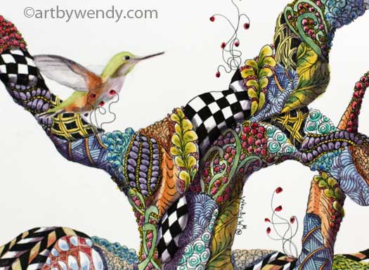
Working with my tangles has at first seemed a long way from my usual work.  (My daughter would certainly tell you that!) But my tangled forest series has really lead me to new things.  Shadows and Reflected Light have become my focus.  When I build my forest with patterns and colour I found I had to use shadows and reflected light to make my birds and animals really 'settle in' to their new home.

Note the reflected light on eagle. 
Detail from WATCHING THE EDGE
(Sorry I should have photographed him before I added the bits of yellow and green to his wings and underbelly) Believe me, he looked so out of place before they were added. I wasn't even sure I could do it. Put green and yellow on his lovely white chest!!  It seemed so wrong. You know a bald eagle is white and black. I was desperate.  He just didn't look right.  So I did it!   Once I did, I realized the difference it made. Of course he would get reflected light from my 'trees'.

Try stepping out of your box.  New adventures are waiting for you.

 Be sure to like and share my posts. You won't miss a single one if you follow by email or Like my Facebook Page. Keep up with all the art events by joining my email list (see sidebar)
Have a great artful day, Wendy

Jan 21, 2016

Integration, Part 2 - Art Tips: Multiple References Photos

NEW WORKS FROM THE STUDIO OF ART BY WENDY

Its winter around here so no plein air adventures for me. 

I could do frozen watercolour paintings and I have a friend that does but it is not for me.  I like surprises in my texture, which you certainly get with frozen watercolour work but . . . Okay.  I am a wimp.  It is too cold for me!  Or I could say, on the west coast here it doesn’t get cold enough but we did have a few days in December and early January that would certainly have worked.  (By the way, if you are looking for information on frozen watercolour paintings contact Alfred Muma, in Powell River. He likes to play around with that.)


So this article is for wimps!   

HUMMING TANGLES - Ink & Watercolour - 5 x 7 Available

We work in our studio in the colder months, using our reference pictures from the summer.  And if you are like me, you have lots!!  The digital age generates a great reference library. 

Things are wonderful if my photo tells me everything.  However, you may be lucky enough, or should I say, experienced enough in photography, to get that one great shot that tells all.  But I am not.  I usually end up with several photos:  maybe using the background from one; the angle or expression from another; and more information from a third. 

This is where the trouble starts.

In my case it is usually a bird or an animal I am working with as I am a wildlife artist.  However, integration issues are there for whatever the subject.  (I have talked about other integration issues in my blogs and there is a list of several related posts below this one.) If you have done all the other things I have mentioned in my blogs and you are still not happy, I have more to suggest.

This is Integration - settling in.

Even if colour, size and other issues are addressed your subject needs to “settle in”.   It needs to feel like it belongs there.  Not something that is floating on top, you know, the ‘pasted on’ look. 

To really make your subject feel at home in the environment, it needs to be “in it”.  This means the environment should be around it; something behind it; beside it; and in front of it.  You are going to say, “I have a background, mid-ground and foreground, but things are still not working.” 

The key element is ‘in the environment’.  Here is the situation, the bird is placed on the branch, the background, mid-ground and foreground are there.  But the bird looks pasted on.  The answer, put something from the foreground in front of the bird.  It doesn’t have to be much, a branch or a leaf, something to tell the viewer that the bird is really “in the setting”. 


Through the magic of Photoshop I removed the branch in front of my hummingbird in Humming Tangles.  See the difference.  Even in a surreal forest, that little flowering branch, seems to reach out and bring my little hummingbird into the setting.  

Have you any tricks or tips for Integrating a Subject into a different setting?  I would love to hear them.

Be sure to like and share my posts. You won't miss a single one if you follow by email or Like my Facebook Page. Keep up with all the art events by joining my email list (see sidebar) 
Have a great artful day, Wendy

Related Posts on using Multiple Reference Photos:


Jan 14, 2016

Have You Considered the Light? - Art Tips on Using Multiple Photos

NEW WORKS FROM THE STUDIO OF ART BY WENDY

  Inspiration has hit!
A project is on the go!  References are ready.  
You take the bird from this photo, the branches and leaves from that one, put them together beautifully . . .but . . .  something is wrong!

A Friendly Face in the Forest - Watercolour - 12 x 16 
That darn bird looks out of place, it doesn't seem to blend into the setting. 

Have you considered the Light?

Not the shadows, but the light.  There are several things about light that need be looked at in order to properly integrate that bird into its setting.

1. Reflected Light: Here you need to go back to that Apple you had to draw in drawing class. (You just knew I would get my drawing stuff in here somehow.) There is the shadow on the subject but next to it is the reflected light.
Apple with shadow and light patterns 
  This area is very much affected by the colour of objects just below or beside it.  In the case of my Stellar Jay, the glow of the mossy branches are very much in evident below the bird so there would certainly be a green/yellow glow added to his chest and under his tail. See detail picture below.

 For another example see my post on "Afternoon Tea" where the pink of the fuchsias washes over the underbelly of the humming bird.  

2. Ambient light: 
Here I mean the combination of light reflections from various surfaces to produce a uniform illumination over the whole area.  Both subject, background and foreground.

In the case of my Stellar Jay, there is a definite ambient light surrounding him.  In the forested areas that are rich with the greens of moss there is very little direct sunlight.  It is reflected light through the trees and branches.  When everything is draped with moss you just know that the usual rules of sunlight colour will not apply.

I originally had the backlighting on my jay white. I had carefully saved that white while I washed the background, painted the background and painted the Jay.  A real job!  (You acrylic and oil people can chuckle at that as I know if you want a white you can find it in a tube.)  Once things were all in place it was time to evaluate that white.  It definitely needed some of that green/yellow glow - soft and subtle -  but it needed to be there.  
Picture Detail:  Stellar Jay before the colour was added to the white area - his back and crown.


Picture Detail: Stellar Jay after the colour was added to the white area on his back and crown. 


Take a second look at your bird/person/building that you have put into a new setting.  Are there issues with the reflected light and ambient light that you have not addressed?  Put a plastic sheet over your picture and experiment with some colour on the plastic in those areas. 

Step back to evaluate. 

Standing too close makes it hard to see the whole image.  Putting green on a blue bird's belly seems strange up close but stepping back brings it all into focus.

Let me know how it works out for you. 

Special Note for Readers coming from the "Adding Salt to theMix" post, Dec 10, 2015
In the step by step pictourial demo for using salt with watercolour I talked about cleaning up funny spots creating by the watercolour washing up against the frisket.  In this case there were some funny lines near my Stellar Jay's face, an important area in the picture.  As you can see from the picture details above,  once the glazing was done for the background, things are fine. If the background had been a plain smooth surface it would have been much harder to lift and blend things in.  But with a mottled background lights and darks blend into the foliage. 

Be sure to like and share my posts. You won't miss a single one if you follow by email or Like my Facebook Page.
 Keep up with all the art events by joining my email list (see sidebar)
Have a great artful day,
Wendy

Jan 7, 2016

Out with the Old, In with the New!!

NEW WORKS FROM THE STUDIO OF ART BY WENDY

Here we go!!   Are you ready for the whirlwind of 2016? 

 Wait a minute . . .!
Bear - Christmas Commission
Graphite and Coloured Pencil

A few things must be done first. 


Kinda like your mom making you wash your hands before you get to dig into your most favorite, lushes, delicious dinner.  

It is the boring stuff: booking keeping and inventories.  Yuck! And Yuck!!  Inputting expenses, not fun; inputting sales, nice.  But this is more than a horrid excise.  Like your Mom's instructions, there are benefits.  And really after playing outside it is healthier to wash those hands before eating.   

Closing down 2015 with book-work really does have benefits. Of course if you are smart you will arrange a special treat when you are done!  (Don't forget to wash your hands first).

So here goes:
1.     Don't just post those expenses, look at them.  What contests, juried shows,  art markets and events did you enter this year. Which ones were good, which should be skipped?

2.    The Sales: yes the highlight of our painting life.  Enjoy the moment, let the ego be stroked.  Now look at them. Where and how did they happen?  What can be done to repeat the success?

3.    Inventory: OK, hard to be positive with that one.  I love math and numbers but counting every little things really takes incredible will power and at least one trip to Starbucks.

4.    Reflections: Yes, reflections are important.  Like every other business you need to do reflections.  What did you really enjoy in your marketing process in 2015?  What really worked?  (I hope they were the same thing) What was a bust?  I am a firm believer in working towards what you enjoy.  I think that if your heart is in, you and your work will reflect it. This is where your direction for 2016 will come. Finding better ways to match your enjoyment with your marketing. 

 Now you are ready for 2016 can begin - setting new goals, trying new things, following new inspirations.  Exciting stuff!!

February is Marketing Month for Artists, a time to prepare for the year.  Join me for a full day  Marketing Workshop "Let's Get Your Art Out There!",  February 21 or February 28. You will come away with new strategies and goals for 2016.  The synergy that builds through the day will carry you through the year and make it your best year ever. More Info: www.artbywendy.com - Workshops

 Be sure to like and share my posts. You won't miss a single one if you follow by email or Like my Facebook Page. Keep up with all the art events by joining my email list (see sidebar)
Have a great artful day,
Wendy